An identity with an injection of fire for a startup investor
ABOUT
Eldar Ventures corporate identity—The Icelandic-Czech company Eldar Ventures, which builds and invests in European startups, has received a new spark in the form of corporate identity. With a growing portfolio of online startups and expansion plans, the company has asked for rebranding that would reflect their love of technology and passion for igniting new projects.
SCOPE
Brand narrative
Logo design
Verbal identity
Corporate identity
Website design
Promo materials

Design of the logotype

Development of the spark icon

Logo versions and usage on coloured backgrounds
CONCEPT
Igniting fires—The logo and identity is formed from the name Eldar, which is Icelandic for fires. Eldar Ventures ignites “fires” in the form of new products (either investing in them or creating them in their own software development department). The colours were selected to reflect a fusion of two cultures: Icelandic and Czech.

Typography reflects the company's focus on technology.


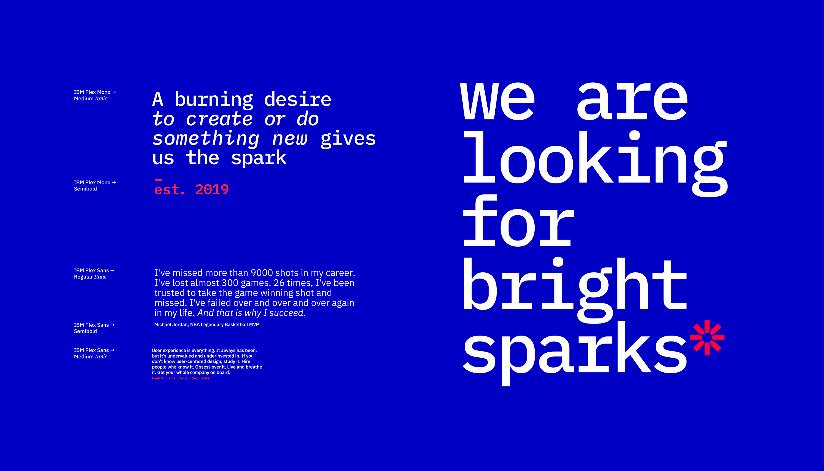


Corporate colours are defined primarly for digital use
MATERIALS
A spark symbolizes start of something new and also “coming up with ideas”. It represents Eldar‘s spirit and is used on all materials. Red and blue are a very classic colours, but the saturated tones indicate focus on IT and bold approach to projects. The font too indicates a digital focus of the company.
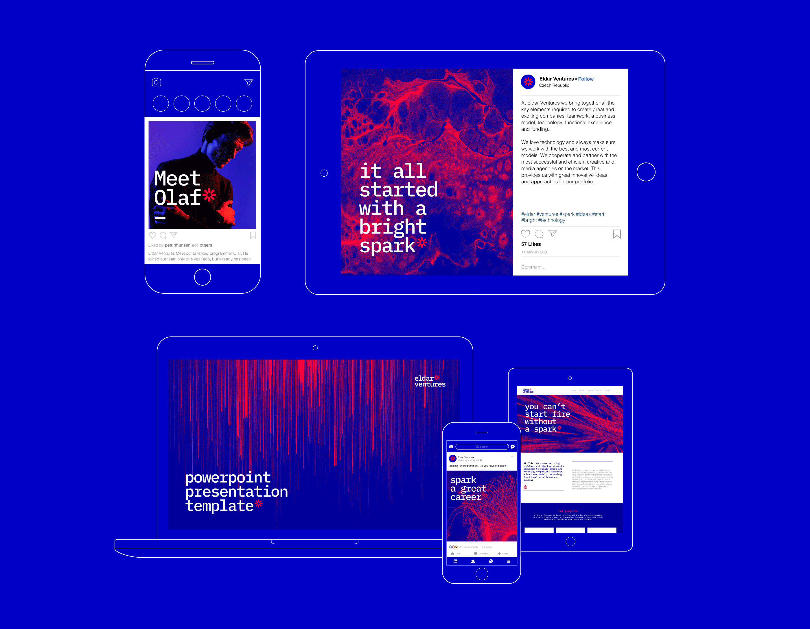
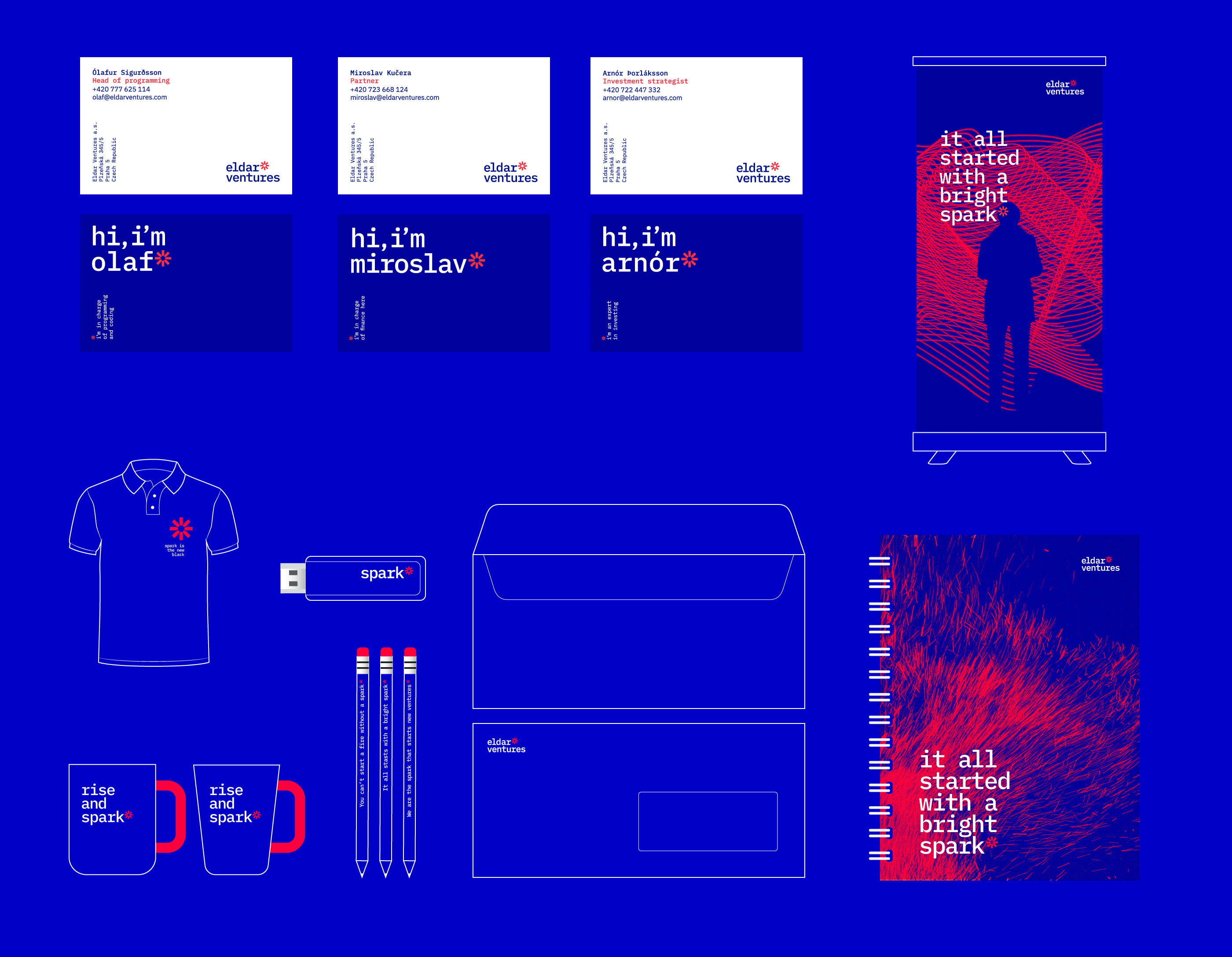

Promotional direct mail
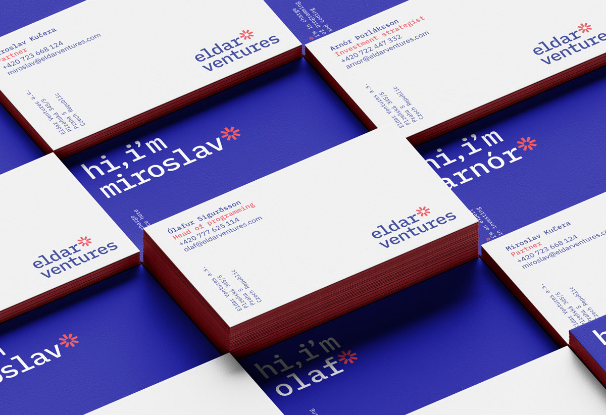
Business cards
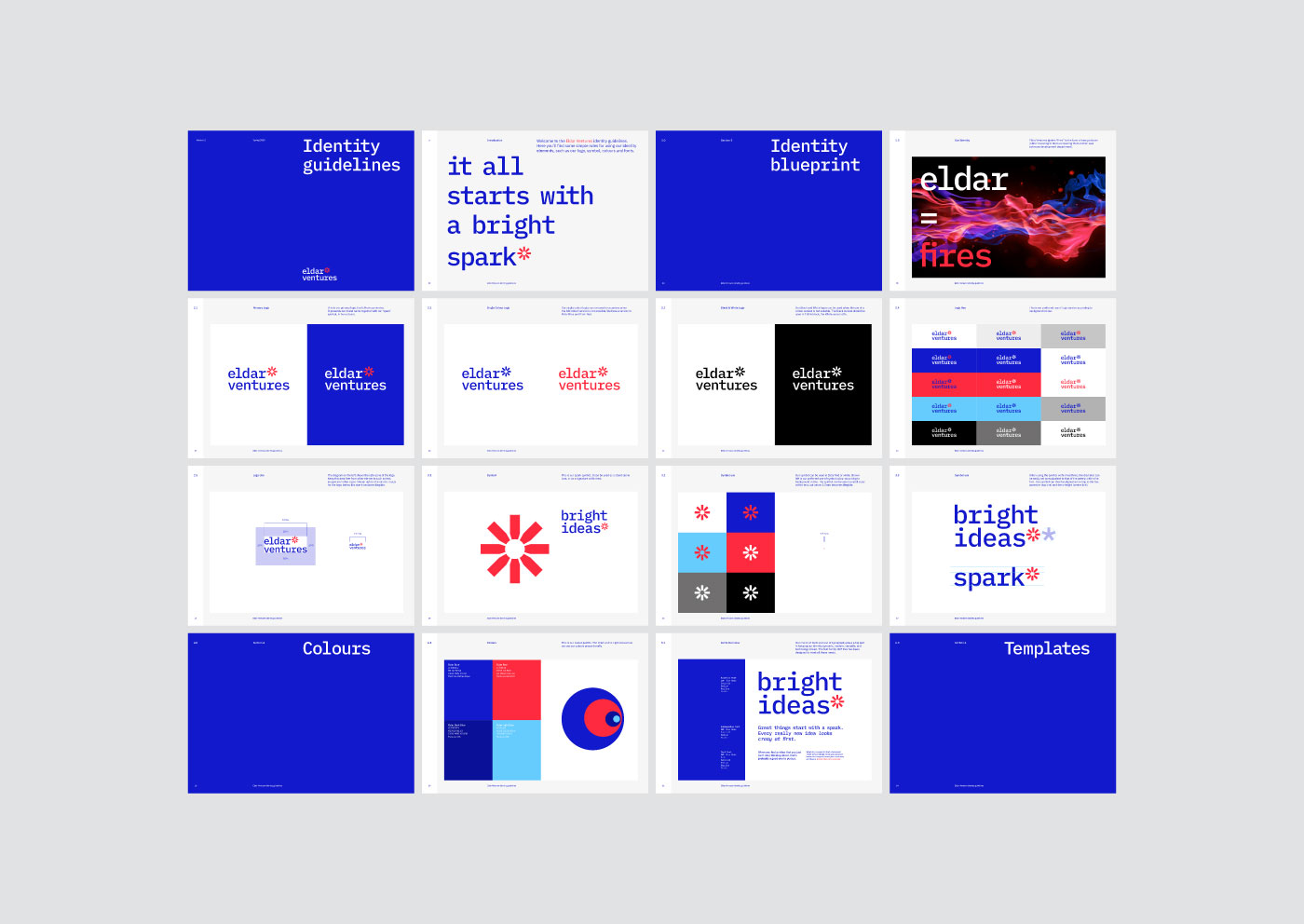
Eldar Ventures corporate identity guidelines
If you want to achieve
the full potential of your
brand—get in Touch.
STUDIO
Touch Branding
Drtinova 557/8 (level 1)
150 00 Praha 5 – Anděl
Czech Republic
Show map
CONTACT
New Business
info@touchbranding.com
Job Opportunities
jobs@touchbranding.com
